2018-4-20 seo達(dá)人
如果您想訂閱本博客內(nèi)容,每天自動發(fā)到您的郵箱中, 請點(diǎn)這里
最近學(xué)習(xí)了Flex布局,
以下是阮一峰老師關(guān)于Flex的博客 。在此感謝他讓我get一項(xiàng)新技能!
Flex實(shí)戰(zhàn)篇:http://www.ruanyifeng.com/blog/2015/07/flex-examples.html
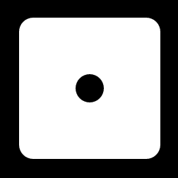
1、色子數(shù):1
思路:讓圓點(diǎn)(即子元素)在橫軸上居中在豎軸上居中,分別用justify-content和align-items
實(shí)現(xiàn)代碼:
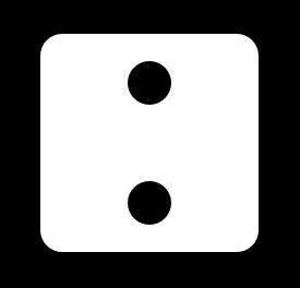
思路:豎列布局且在主軸方向采用justify-content的兩端對齊布局,這樣兩個圓點(diǎn)會在左邊呈現(xiàn),然后采用align-items讓其居中
實(shí)現(xiàn)代碼:
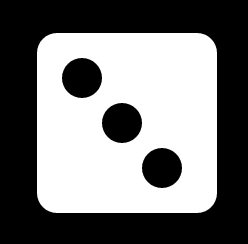
思路:用到align-self屬性讓第二個和第三個圓點(diǎn)有自己的屬性設(shè)置,分別在縱軸方向上居中和低端對齊
實(shí)現(xiàn)代碼:
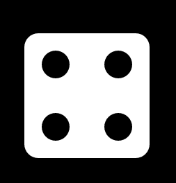
思路:先豎著放兩行圓點(diǎn),每行圓點(diǎn)里橫著放兩個圓點(diǎn),所以最外層父元素設(shè)置align,里面的父元素設(shè)置justify-content
實(shí)現(xiàn)代碼:
實(shí)現(xiàn)代碼:
思路:跟四點(diǎn)的一樣,先豎放三行在每行橫放兩個圓點(diǎn)
實(shí)現(xiàn)代碼:
<!DOCTYPE html>
<html>
<head lang="en">
    <meta charset="UTF-8">
    <title></title>
    <style> *{  margin:0;  padding:0;  }  body{  background:#000;  }  .main {  width: 200px;  height: 200px;  background: #fff;  border-radius: 20px;  margin: 100px auto;  padding: 25px;  -webkit-box-sizing: border-box;  -moz-box-sizing: border-box;  box-sizing: border-box;  display: flex;  justify-content: center;  align-items:center;  }  .main >div{  width:40px;  height:40px;  background:#000;  border-radius:40px;  }  </style>
</head>
<body>
<div class="main">
    <div class="item"></div>
</div>
</body>
</html>
2、色子數(shù):2
<!DOCTYPE html>
<html>
<head lang="en">
    <meta charset="UTF-8">
    <title></title>
    <style> *{  margin:0;  padding:0;  }  body{  background:#000;  }  .main {  width: 200px;  height: 200px;  background: #fff;  border-radius: 20px;  margin: 100px auto;  padding: 25px;  -webkit-box-sizing: border-box;  -moz-box-sizing: border-box;  box-sizing: border-box;  display: flex;  flex-direction: column;  justify-content: space-between;  align-items:center;  }  .main >div{  width:40px;  height:40px;  background:#000;  border-radius:40px;  }  </style>
</head>
<body>
<div class="main">
    <div class="item"></div>
    <div class="item"></div>
</div>
</body>
</html>
3、色子數(shù):3
<!DOCTYPE html>
<html>
<head lang="en">
    <meta charset="UTF-8">
    <title></title>
    <style> *{  margin:0;  padding:0;  }  body{  background:#000;  }  .main {  width: 180px;  height: 180px;  background: #fff;  border-radius: 20px;  margin: 100px auto;  padding: 25px;  -webkit-box-sizing: border-box;  -moz-box-sizing: border-box;  box-sizing: border-box;  display: flex;  }  .main >div{  width:40px;  height:40px;  background:#000;  border-radius:40px;  }  .item:nth-child(2){  align-self:center;  }  .item:nth-child(3){  align-self:flex-end;  }  </style>
</head>
<body>
<div class="main">
    <div class="item"></div>
    <div class="item"></div>
    <div class="item"></div>
</div>
</body>
</html>
4、色子數(shù):4
<!DOCTYPE html>
<html>
<head lang="en">
    <meta charset="UTF-8">
    <title></title>
    <style> *{  margin:0;  padding:0;  }  body{  background:#000;  }  .main {  width: 180px;  height: 180px;  background: #fff;  border-radius: 20px;  margin: 100px auto;  padding: 25px;  -webkit-box-sizing: border-box;  -moz-box-sizing: border-box;  box-sizing: border-box;  display: flex;  flex-wrap:wrap;  align-content:space-between;  }  .column >div{  width:40px;  height:40px;  background:#000;  border-radius:40px;  }  .column{  flex-basis:100%;  display:flex;  justify-content: space-between;  }  </style>
</head>
<body>
<div class="main">
    <div class="column">
        <div class="item"></div>
        <div class="item"></div>
    </div>
    <div class="column">
        <div class="item"></div>
        <div class="item"></div>
    </div>
</div>
</body>
</html>
5、色子數(shù):5
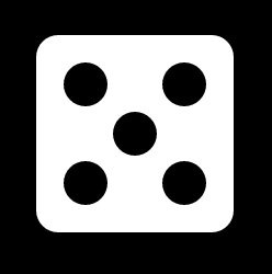
<!DOCTYPE html>
<html>
<head lang="en">
    <meta charset="UTF-8">
    <title></title>
    <style> *{  margin:0;  padding:0;  }  body{  background:#000;  }  .main {  width: 180px;  height: 180px;  background: #fff;  border-radius: 20px;  margin: 100px auto;  padding: 25px;  -webkit-box-sizing: border-box;  -moz-box-sizing: border-box;  box-sizing: border-box;  display: flex;  flex-wrap:wrap;  align-content:space-between;  }  .column > div{  width:40px;  height:40px;  background:#000;  border-radius:40px;  }  .column{  flex-basis:100%;  display:flex;  justify-content: space-between;  }  .column:nth-child(2){  justify-content: center;  }  </style>
</head>
<body>
<div class="main">
    <div class="column">
        <div class="item"></div>
        <div class="item"></div>
    </div>
    <div class="column">
    <div class="item"></div>
    </div>
    <div class="column">
        <div class="item"></div>
        <div class="item"></div>
    </div>
</div>
</body>
</html>
6、色子數(shù):6
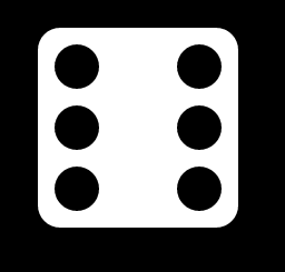
<!DOCTYPE html>
<html>
<head lang="en">
    <meta charset="UTF-8">
    <title></title>
    <style> *{  margin:0;  padding:0;  }  body{  background:#000;  }  .main {  width: 180px;  height: 180px;  background: #fff;  border-radius: 20px;  margin: 100px auto;  padding: 15px;  -webkit-box-sizing: border-box;  -moz-box-sizing: border-box;  box-sizing: border-box;  display: flex;  align-content:space-between;  flex-wrap:wrap;  }  .column > div{  width:40px;  height:40px;  background:#000;  border-radius:40px;  }  .column{  flex-basis:100%;  display:flex;  justify-content: space-between;  }  </style>
</head>
<body>
<div class="main">
    <div class="column">
        <div class="item"></div>
        <div class="item"></div>
    </div>
    <div class="column">
        <div class="item"></div>
        <div class="item"></div>
    </div>
    <div class="column">
        <div class="item"></div>
        <div class="item"></div>
    </div>

</div>
</body>
</html>
藍(lán)藍(lán)設(shè)計(jì)( www.lzhte.cn )是一家專注而深入的界面設(shè)計(jì)公司,為期望卓越的國內(nèi)外企業(yè)提供卓越的UI界面設(shè)計(jì)、BS界面設(shè)計(jì) 、 cs界面設(shè)計(jì) 、 ipad界面設(shè)計(jì) 、 包裝設(shè)計(jì) 、 圖標(biāo)定制 、 用戶體驗(yàn) 、交互設(shè)計(jì)、 網(wǎng)站建設(shè) 、平面設(shè)計(jì)服務(wù)
藍(lán)藍(lán)設(shè)計(jì)的小編 http://www.lzhte.cn